Tips

Preparing for the Architect-Client Interview

The first meeting is an opportunity for us both to interview each other. It is very important that everyone that will be involved in the design process be together at the interview so that we all get the chance to ask questions and get a sense for what it would be like to work together.

"What do you need from us?"

Brief written description of your goals for the project, including:

  • list of "must-have" items, "would be nice to have" items, and "don't want" items (Note: If all of the people living in the house don't agree about the goals, it is helpful to know what differs.) 
  • budget for the construction cost of the project (for more insight into costs, see HOW MUCH WILL MY PROJECT COST?). 
  • timeline for the project (when you will be ready to start design, begin construction, and move in) 
  • Inspiration photos from magazines, books, vacations, etc. (Note: It is not necessary that these photos be "the answer" to your goals, so don't exhaust yourself trying to find that! It is more helpful that you find photos of things you like, even if the photos represent a variety of architectural styles. A photo of a "cozy corner" may look different for you than it would for someone else, so photos really help me tune into your own personal taste and learn what those words mean to you visually and experientially. Even photos of something you really DON'T like can be helpful for comparison.) 

Information that you may have about the house and/or lot, such as:

  • old blueprints - whether original or from previous remodels 
  • survey 
  • "Improvement Location Certificate" - Sometimes found in your mortgage documents, this is a drawing that shows the outline of your house, garage, etc. (the "improvements"), with dimensions of the structures and of the lot itself. Sometimes, easement information and encroachments may be included in this document. If you do not find a one in your file, you may want to check with your title company to see if there was one obtained on your behalf. I have found that the drawing does not always make its way into your loan document package.
  • copy of previous appraisal 
  • if you're changing the exterior appearance of the house, it is helpful to know if you anticipate problems with your neighbors 
  • neighborhood covenants, if any 

"Walk and Talk"  One of my favorite things to do is to be guided around a house by potential clients, listening to what they do and don't like about their homes. It is fun to learn what they wish for, what they've already changed, and how they see themselves living there.

The Truth About Green Design

From the food you eat to the car you drive (or bus you ride), the idea of being "green" has become a part of daily life in America, especially in forward-thinking cities such as Seattle.

When I have clients who ask about whether or not I do "green" design, the answer is, "Of course!" I have always been motivated by eco-consciousness and energy conservancy. Now we just have more and better tools available.


A "green" green sink. Salvaged, recoated, and repurposed in the laundry room.

But, what does it really mean for YOU and YOUR project?  First, I need to understand your motives and objectives. Clients often fall within one or more of the following categories:

Good Steward  You want to do what you can for the environment. You want to reuse what you can and donate what you can't, even if that means you have to invest more money in labor. When you cannot find suitable salvage, you want to purchase products that are "green."

Health Conscious  You have chemical sensitivities or underlying health conditions which have made you greatly concerned about the off-gassing of products, as well as dust and mold. 

Investor in Technology  You want to support alternative energy innovation by using systems such as solar heating and rainwater harvesting, even if the initial investment is significant and the payback period is long.

Conservationist  You want to consume less, and get more out of what you already have. You are not willing to be experimental and would rather "go with the known".


Cabinets like these are excellent candidates for donation to a salvage company in exchange for store credit, tax credit, or cash.

Prioritize

It is very rare for a client to say "yes" to all of the above categories and also be willing to accept the higher price tag for materials and labor that accompanies that decision. Nearly everyone has to at least prioritize their eco-goals, finding the best intersection of cost, return on investment, comfort, and impact on the environment.


One person's junk is another person's treasure. This mantel was salvaged from a home on Capitol Hill in Seattle.

Buyer Beware

The marketplace is flooded with "green" products (including many inferior or fake ones), and using those products doesn't necessarily make your project a "green" project. Ask yourself the following questions:

  • Is there suitable salvage that would be an alternate? 
  • How long will this product last? 
  • How much of this product is wasted during installation? 
  • If recycled content is important, what percentage and what type of recycled material does it contain? 
  • How much energy does it take to produce and transport this product? 
  • Is the source renewable? 
  • How reliable is the information? 
  • How much more does this material cost, and how does that compare to additional labor for reused or salvaged material? 
  • How difficult will it be to maintain this material or this installation? 
  • If resale value is important, how does this choice factor in? 
  • Is this trendy? Will it go out of fashion? 

Establishing this criteria at the beginning of the design process allows us to filter each decision according to your objectives, reducing frustration and delivering the best outcome for your budget, life, and the environment.

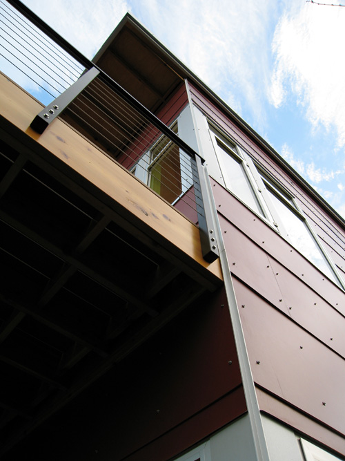
Fiber cement rainscreen siding, aluminum windows, composite decking on cedar framing

The Secret to Picking the Perfect Paint Color

For many homeowners, picking the perfect paint color is a daunting task - prone to error, causing arguments, piling up receipts for samples or do-overs, and sometimes resulting in the decision to "just give up and paint it white". 

This is why I include paint color selection as a part of my architectural services. Having done this many times before, I make it easy and fun for my clients.

I use a the Benjamin Moore professional sample kit that includes large sheets of individual colors. If you don't have a professional to work with who can supply you with these, you may want to purchase the Benjamin Moore Fan Decks and then 

Here are some things to remember when selecting paint color:

A lot of men are color blind.  One of every ten men have some form of color blindness, while women are rarely affected. There are different severities and types of color-blindness. The most common type is the inability to distinguish red and green. This can be very challenging when looking at various shades of paint colors, as often the only difference between two colors will be the amount of red or green undertone.

All whites are not the same.  If you hold a fan of "whites" at arm's length, you would think they were colors like blue, pink, grey, or yellow. Yet, each of them are considered "white". I have heard the following statements, each of which is a clue that my clients need help, whether they realize it or not: 

  • "The contractor said he has a white that they used before, so we'll just use that."

  • "I just want white."

  • "We don't want any color, just an off-white."

  • "My mother says we should use antique white."

Benjamin Moore Off White Collection Fan Deck (click here to order from amazon)

Benjamin Moore Off White Collection Fan Deck (click here to order from amazon)

Complex colors change in different light. Many of the popular brands of paints have a complex color base. This makes the color very rich, whether light or dark. It also affects the color's appearance in different types of light. When you select colors, you should look at them in the type and intensity of light they will be seen in. DO NOT pick your paint colors on the floor of a fluorescent-lit showroom. 

The trickiest colors are green, khaki, and grey.  In my experience, the colors that appear the most different according to the quality and type of light are green, khaki (or camel) and grey. When I select one of these colors, I pull as many samples out of the oversize fan as I can find and pin them all up, either in the intended location or in the closest facsimile of the environment. I look at them several times throughout the day as the light changes, and remove any chip that begins to take on the appearance of another color. Green will tend to shift to brown. Khaki will tend to shift toward either purple or green. Grey will tend to shift to purple or blue.

Be careful with luminous colors.  If you adore "happy colors," remember that a color can be bright without being luminous. I once had a client who wanted a bright green bedroom, the color of the flesh of a lime. The color she chose was very luminous - meaning that it had a "glow." As a small chip, it was very appealing. But, when the whole room was painted, the color bounced off every wall, making the room so intense that the painters could only be in there for a short period of time before having to step outside to allow their eyes to adjust back to normal. (That room was immediately repainted a soft yellow.)

Color looks more intense on ceilings.  A paint chip with a hint of color will take on the appearance of a strong color when painted on a ceiling. 

The blue on this ceiling is actually a white with the slightest hint of blue hue that makes it look blue next to the creamy white trim.

The blue on this ceiling is actually a white with the slightest hint of blue hue that makes it look blue next to the creamy white trim.

Exterior house colors always look lighter than expected.  Selecting exterior house colors is one of the most challenging tasks. Nearly everyone who has chosen their own exterior paint will tell you they wish they'd gone darker. 

The sun is an incredibly powerful light source, even in the Pacific Northwest, and it affects the appearance of color dramatically. In fact, exterior paint always looks significantly lighter than the swatch once on your house. When you are choosing exterior colors, you should be looking at the darkest colors in the range. If you there is a house in your neighborhood you like, it is well worth knocking on the door to ask what color they used or to ask permission to bring your paint fan with you to compare swatches with their house. 

Consider the items that will go in the room.  Does the furniture have a red or green undertone? Are there things in the room that will contrast too much with the color? Is there something that you want to use as a focal point against the color such as artwork or antiques? Are there things on the ceiling that you don't want to draw attention to? (A color on the bathroom ceiling might sound like a fun idea, but remember that the exhaust fan, ceiling lights, etc. will be more noticeable than they would against a soft white.) 

Avoid trendy colors.  The retailers have a knack for rotating color trends, and today's beautiful green will soon be dated. The exception to this rule is choosing a color that is currently "trendy" but is one that you have ALWAYS loved. If you have loved it your entire life, you probably always will. If it is a new color that you are enjoying, have fun with your towels, bedcovers, or rugs. It is easier to rotate those when you become sick of the color than it is to repaint the room. 

Question the accent wall idea. My theory is that if you want a color but only on one wall, you probably aren't convinced that you like the color - or that you will like it for very long. Here is another opportunity for tablecloths, rugs, towels, etc. to take on that role. A true accent wall uses a contrasting or more saturated color to emphasize the architectural features of a space, not to showcase a fad.

Ask for help. I bring every Benjamin Moore and Sherwin Williams color created into my client's homes, sparing them the confusion at the paint counter. Rather than looking at tiny strips of five or six shades, we look larger swatches of individual colors. My paint kit is organized by the amount of undertone in each color, so it is easy to predict which colors will tend toward red, green, blue, or purple, based upon where the color is located within the stack of each color. I leave these swatches with my clients and order replacements for my kit.

Benjamin Moore Paint Color Sheets

Benjamin Moore Paint Color Sheets

If you don't have access to a professional who uses this kit, you will want to order fan decks so that you have lots of options to view in your home.

Test it out.  After my clients have had some time to look at the color swatches in various lighting over a few days, we select a few to mock-up on the wall. We don't use the little paint pots or pouches unless they are the exact brand AND sheen we intend to use, since both of these factors affect the color's appearance. We normally have mock-ups painted in 12"x12" or 24"x24" squares, in both the brightest and darkest spots of the room. 

If you'd rather not put the samples directly on your wall, you can paint the samples onto large pieces of foam core to help you visualize.  

Join the conversation. Have you used these tips to select the perfect paint color for you space? Comment to tell us about your challenge and what color you ended up using. 

Disclaimer: Some of the links in this article are affiliate links, meaning, at no additional cost to you, I will earn from qualifying purchases as an Amazon Associate if you click through and make a purchase.  All opinions are my own.