paint

Can't-Go-Wrong Paint Color Palettes

PRODUCT LINES

Disclaimer: Some of the links in this article are affiliate links, meaning, at no additional cost to you, I will earn from qualifying purchases as an Amazon Associate if you click through and make a purchase.  All opinions are my own.

Miller Colorevolution (the replacement for Devine Color)

Miller-Colorevolution.jpg

Earlier this year, Miller Paint Co. discontinued use of the Devine Color trademark its licensing agreement with Valspar Corp.  Devine Color was developed specifically for the overcast skies of the Pacific Northwest.  There was just something magical about their rich, proprietary paint base that added depth to the colors, unmatched by its competitors

Thankfully, Miller has introduced a new line of paint, the Evolution line, which uses the same paint formula as Devine.  The Colorevolution series is a similarly curated selection of just 168 colors inspired by designers in the Northwest.  If you are easily overwhelmed by too many choices, or if you are going for rich-but-not-too-dark colors, this is my recommendation if you have Miller Paint stores in your area.

Benjamin Moore Affinity


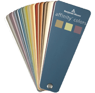
Benjamin Moore markets its Affinity paint colors as so easy to match that you can flip the sample book upside down and pick 3 colors, any 3 colors.  One for walls, one for trim, and one for an accent color.  Not that I would do that -- but the point is that all the colors in the fan go with all the other colors in the fan, so there is no chance of clashing colors. They won't say what their secret is, but they are giddy about discovering whatever it is.  The paint is expensive, but if you are worried about your ability to pick colors that will "go" together, this is a nice trick to know about. Click here to order your Affinity Fan Deck from amazon.   

BEST ADVICE

Even with the color palette in your favor, I would STILL swatch.  Buy a sample size and paint it on a piece of foam core (available at your local crafts or art supply store), drywall, or masonite that you can move around the room.  2' x 2' is a perfect size.  Lighting, both artificial and daylight, make a huge difference on how a color will look in a room.  Examine the color in the most brightly lit area of the room as well as in the darkest.  

And, please be sure that you are looking at the new color on a neutral background.  Prime the wall first, or get a large white area around the paint swatch (you could hang a large piece of paper or a sheet).  That way, you won't be analyzing the swatch within a field of color that may shift the appearance of the swatch color itself.  

Disclaimer: Some of the links in this article are affiliate links, meaning, at no additional cost to you, I will earn from qualifying purchases as an Amazon Associate if you click through and make a purchase.  All opinions are my own.

Decorating the early 1900’s home (Part Two - Kitchens, Bathrooms & Porches)

Here are some highlights from Domestic Architecture, written by architect L. Eugene Robinson, published in 1917. PART ONE of this post contained excerpts regarding living room and bedroom finishes. The excerpts below address kitchen, bathroom, and porch finishes:

Kitchen

  • “...cleanliness is of first importance, the treatment of materials should suggest it, and decoration need not be neglected.” 
  • “have all surfaces so treated that dust and dirt will show, but will be easy to remove. Here glazed or glossy finishes, or semi-glazed, ...are desirable.” 
  • “Plaster may be given a slick, steam-proof varnish or paint, and the wood given an enamel finish.”
  • “Wallpapers having a glazed surface are in common use...” 
  • “...should be no crevices or angles not easily reached with ordinary cleaning apparatus.” 
  • “Severity of design is becoming to the nature of the kitchen. Simple wainscotingsare very serviceable and attractive, and may be counter height, thereby forming a continuous line around the room.” 
  • “...counters...should not be treated with paint, varnish or any other material except oil. However, such working surfaces may be covered with a matting of rubber or oilcloth.” 
  • “Tile work...is highly serviceable, wainscotings, counters, facings for built-in ranges and floors being the chief parts constructed of this material.” 
  • “...main objection to tile floors is their coldness...” 
  • “A hardwood floor of oak or maple is best, if tile cannot be afforded. A cheap wood floor may be made very serviceable by laying upon it oilcloth orlinoleum.” 
  • “Color...should...suggest perfect sanitation. The best colors are white and blue, but with white or cream may be used green, brown, gray or other color.” 
  • “Colors may appear in tile borders, linoleum, wallpaper, painted surfaces and in simple hangings.” 
  • “...should be bright and pleasant but not cluttered.” 
  • “Extra large kitchens...should have more color than small ones.” 
  • Fabulous and fun vintage kitchen photos can be found at www.shorpy.com. For a direct link, click HERE

Bathrooms

  • “Surface treatments...much the same as those for kitchens. Waterproof materials are practically essential, where water and steam are so prevalent.” 

Porch

  • “Porches are really exterior features, and should be treated much the same as other parts of the exterior.” 
  • “Light-colored paints and stains generally look better than dark.” 
  • “Masonry should not be painted under any circumstances...” 
  • “Porch floors of wood should receive several coats of exterior floor paint of neutral color, while the ceilings should be painted white or buff.” 
  • “...more than two colors of paint on a frame house should not be used, except perhaps in very limited quantities.” 
  • “The main color should cover the body of the house, while the other should serve only as a trim color. Alternate color effects should never be used.”

Decorating the early 1900’s home (Part One - Living Rooms & Bedrooms)

When it comes to finish materials, where do you go to find out what is truly period-appropriate for your vintage home?

While antique shopping in Oregon last summer, I found a book published in 1917 by an architect named L. Eugene Robinson, titled Domestic Architecture. The book was intended for homeowners who were remodeling or building homes at that time, and much of what was written is relevant for restoration or remodeling turn-of-the-century homes today.

Here are some highlights regarding interior finishes for living rooms and bedrooms:

Living Rooms

  • ..should be above all restful.” 
  • “colors should be dull and neutral” 
  • “Old ivory or cream white enamel of semi-dull finish on thewoodwork, oatmeal paper of light brown on the walls, light buff paper on the ceiling, and any good flooring with, perhaps, Oriental rugs...” 
  • “...it is not well to slavishly hold to the color and tones of the scheme. If this is done, the effect will be monotonous, which is not restful. There should be judicious departures in color, chiefly in the furnishings, and especially in certain architectural features such as fireplaces, floors, and ornamental glass windows.” 
  • “As a rule, the gradation of color should be such that the ceiling is light, the frieze less light, the wall and wainscoting darker, and the floor darkest.” 
  • “A floor may be of very light wood, while the gradation of color starts dark at the base of the wall.” 

Bedrooms

  • “...should have the quality of freshness regardless of the color scheme...” 
  • “While women usually prefer white, pink, blue or yellow rooms, men generally prefer brown, grey or green.” 
  • “Any color scheme that is not disturbing and that does not take on a dingy air may be satisfactorily developed.” 
  • “Wallpaper... is used almost to the exclusion of other materials...” 
  • “On sanitary grounds the painting of bedroom walls is preferable to papering.” 
  • “Woodwork...white or cream in color, firstly because it is neat, fresh and easily washed, and secondly because any bedroom set of furniture will conform to it.” 
  • “A very handsome treatment for a bedroom is to make the woodwork exactly like the bedroom set, of maple, walnut, mahogany, or any hard wood.” 
  • “Maple flooring is very satisfactory for bedrooms.” 
  • “For inexpensive treatments, white paint may be used on the wood trim, and gray paint on the floor. Sometimes, matting over a common floor proves very satisfactory.” 

(PART TWO  will cover kitchens, bathrooms, and porches.)